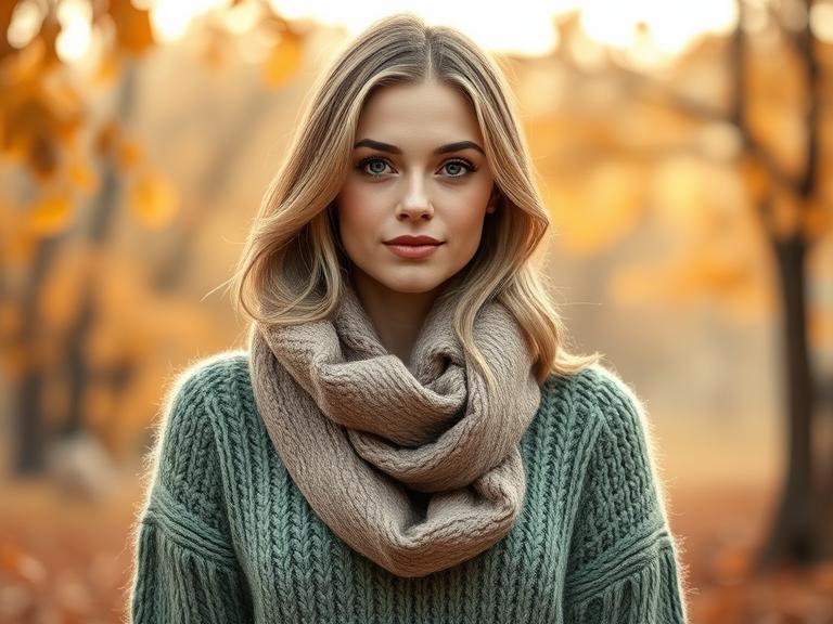
In the world of seasonal color analysis, where individuals are categorized by the hues that harmonize most naturally with their innate coloring, the Soft Autumn palette stands out as a study in understated elegance. It is the gentle whisper of color amidst the louder declarations of winter and the vibrant shouts of true autumn. This palette doesn’t demand attention; it earns it through its sophisticated, muted, and effortlessly harmonious warmth.
If you’ve ever felt overwhelmed by bright, clear colors or found that stark black and pure white wash you out, you may have found your home in the Soft Autumn spectrum. This guide will delve into the essence of the Soft Autumn color palette, exploring its core characteristics, how to identify if it’s right for you, and how to weave its serene magic into your wardrobe, home, and life.
The Essence of Soft Autumn: Muted and Warm
The Soft Autumn palette sits at the crossroads of the Autumn and Summer families. It inherits the warm, golden undertones of Autumn but is softened and diluted by the muted, greyish quality of Summer. Imagine the colors of nature during a perfect, hazy autumn afternoon—the sun is low and diffused by a light mist, casting a gentle, golden glow over the landscape. This is the environment from which the Soft Autumn colors are drawn.
The two defining characteristics of this palette are:
-
Muted (Low Chroma): This is the most important attribute. Soft Autumn colors are not bright, vivid, or clear. They are toned down, greyed, or dusted over. They lack intensity and have a softened, almost powdery quality. Think of a ripe apricot versus a neon orange, or sage green versus a lime green.
-
Warm (Golden Undertones): Despite their softness, these colors are inherently warm. They have a yellow or golden base running through them, as if touched by the last rays of the autumn sun. This warmth is subtle, not the fiery heat of a True Autumn.
The Core Soft Autumn Color Palette
The palette is a collection of gentle, earthy, and watery hues. Forget about sharp contrasts; here, colors blend seamlessly into one another.
-
Neutrals: These are the foundation of a Soft Autumn wardrobe.
-
Greiges and Taupes: Not a cool grey nor a stark beige, but the perfect blend of both—warm, soft, and incredibly versatile.
-
Soft Olive Khaki: A muted greenish-brown that is both earthy and refined.
-
Medium Warm Grey: A grey that has been warmed with a touch of brown or yellow.
-
Mushroom Brown: A soft, greyish brown that is deeply elegant.
-
-
Greens: The greens of Soft Autumn are the colors of moss, sage, and faded eucalyptus.
-
Sage Green: A dusty, grey-green that is calming and serene.
-
Olive Green: A warmer, yellower green than its sage counterpart.
-
Celadon: A soft, pale green with a hint of grey and yellow.
-
-
Blues: These are not oceanic or primary blues. They are softer, more reminiscent of a distant, hazy sky or weathered denim.
-
Cadet Blue: A greyish-blue that is both gentle and sophisticated.
-
Soft Teal/Aqua: A muted blend of blue and green, like the water of a shallow, sun-dappled lagoon.
-
-
Reds and Pinks: These hues are warmed with brown and softened to a blush.
-
Salmon: A warm, soft pink with coral and peach undertones.
-
Dusty Coral: A muted version of coral, less pink and more earthy.
-
Terracotta: A muted, reddish-brown, like sun-baked clay.
-
-
Yellows and Oranges: These are the palette’s subtle pops of warmth, never neon or acidic.
-
Mustard Yellow: A deep, muted yellow with brown undertones.
-
Ochre: An earthy yellow pigment, natural and warm.
-
Peach: A soft, creamy orange-pink.
-
-
Purples: These purples are plummy and dusty, never electric.
-
Mauve: A greyish-purple with warm pink tones.
-
Lavender Grey: A dusky, softened lavender.
-
Are You a Soft Autumn? Key Identifying Features
Color analysis is about more than just preference; it’s about how colors react with your natural coloring. A Soft Autumn will typically have the following characteristics:
-
Hair: Hair color is often muted and can range from ash blonde to light or medium mousy brown, to dark ash brown. It may have subtle, natural highlights. There are no stark contrasts between hair and skin tone.
-
Eyes: The eyes are usually soft and blend with the overall coloring. Common eye colors include hazel, soft green, light brown, grey-blue, or teal. They often have a muted, smoky quality.
-
Skin: Skin undertones are warm (golden or peachy) but can be neutral-warm. The overall effect is muted and low-contrast. Skin may appear to have a “soft” quality, and veins may appear slightly greenish.
-
Overall Effect: The key is a low level of contrast between your skin, hair, and eyes. Your features blend into one another softly, without sharp definition. Bright, clear colors will likely overpower you, making you look tired or the clothing appear separate from you.
How to Wear the Soft Autumn Palette
The goal is to enhance your natural beauty, not compete with it.
-
Embrace Monochromatic and Tonal Dressing: Since contrast is not your friend, pairing shades from the same color family is incredibly flattering. Think a taupe sweater with olive-green trousers and a greige coat.
-
Focus on Texture: With a muted color palette, texture becomes your best tool for adding interest. Combine fabrics like cashmere, suede, linen, wool, and silk to create depth and dimension.
-
Metallics: Opt for brushed or antiqued metals. Gold, rose gold, and copper are perfect. Avoid shiny, silver platinum.
-
Makeup: Your makeup should follow the same principles. Choose warm, earthy eyeshadows in taupe, moss, and plum. Blush should be in peachy or rosy-brown shades (like terracotta). Lip colors are best in nude, mauve, warm rose, or soft brick red—avoid blue-toned fuchsias and stark nudes.
-
What to Avoid: The main colors to steer clear of are anything too bright, cool, or stark. This includes black, pure white, electric blue, hot pink, and neon colors. They will clash with your softness and create a harsh look.
Beyond the Wardrobe: Soft Autumn in Your Home
This palette is perfect for creating a calming, cozy, and inviting living space. Use these colors on walls (sage green, warm greige), in textiles (mohair throws in mauve, linen curtains in cadet blue), and decor (terracotta pots, olive green vases). It evokes a sense of peaceful, natural harmony.
Informational FAQs
Q1: Can a Soft Autumn wear black?
A: Traditional color analysis advises Soft Autumns to avoid true black, as it is too harsh, cool, and high-contrast for their muted, warm features. It can be draining. Excellent alternatives include very dark espresso brown, soft charcoal, or a deep, muted olive green. If you must incorporate black, try to keep it away from your face (e.g., black trousers) and balance it with a Soft Autumn color closer to your skin.
Q2: Is Soft Autumn the same as True Autumn?
A: No. While both are warm, True Autumn colors are much more vibrant, saturated, and fiery (think pumpkin orange, deep rust, vivid emerald green). Soft Autumn colors are significantly more muted, dustier, and blended with grey. True Autumns can handle more contrast and intensity.
Q3: What are the best neutral colors for a Soft Autumn?
A: The best neutrals are warm, soft, and earthy. Focus on greige (grey-beige), warm taupe, soft olive khaki, medium warm grey, and mushroom brown. These provide a perfect, harmonious base for your wardrobe.
Q4: Can I wear patterns if I’m a Soft Autumn?
A: Absolutely! The key is to choose patterns that use colors from your palette. Opt for soft, blurred, or watercolor-style patterns. Avoid high-contrast patterns like sharp black-and-white geometrics or neon brights.
Q5: I think I might be a Soft Autumn. How can I test it at home?
A: In natural daylight, drape fabrics near your face (no makeup). Try a soft, warm mauve and compare it to a bright, cool magenta. Try a warm greige and compare it to a stark white. See which ones make your skin look even-toned and glowing versus which ones create shadows, highlight imperfections, or make you look sallow. The right colors will make you look healthier and more rested.


