From simple bar charts to intricate scatter plots, the world of data visualization is full of options that help make large, diverse data sets readily understandable. Among these options, one stands out for its capacity to provide a clear visual representation of multivariate data – the radar chart. Below, we’re taking a closer look at this highly useful tool, shedding light on its functionality, practical applications, and distinct benefits.
Understanding Radar Charts
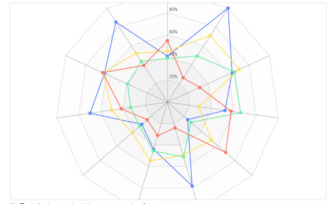
Alt Text: An image depicting an example of a radar chart
At first glance, the radar chart may appear daunting with its web-like design, but its unique strengths lie therein. This graphical method of displaying multivariate data in the form of a two-dimensional chart is known for its convenience and expressiveness. They’re constructed with several axes emerging like spokes from a central point, representing different categories or variables. Each data point is plotted along its respective axis, and these points are then connected by lines to form a polygon.
These charts are especially useful when you need to visualize multiple quantitative variables simultaneously, as they make it easy to compare multiple dimensions of your data in one chart. A single glance at a radar chart can quickly give an overview of the information in a way that many other forms of data visualizations cannot.
By their very nature, radar charts offer a remarkably visual representation of multivariate data, allowing for an immediate understanding of a complex dataset. While radar charts may seem a bit unconventional compared to linear or bar graphs, they are an exceedingly valuable asset in any data analyst’s toolkit when used properly.
How Radar Charts Work
Visualizing data using radar charts offers a unique advantage as it presents multidimensional data in a two-dimensional view, thereby preserving the correlations existing between the variables. The chart’s structure allows for easy comparison of different variables, making it excellent for visualizing performance metrics, for example. For businesses, this could translate into an easy method for comparing the performance of different departments or business units.
All variables in a radar chart are plotted on separate axes that originate from a central point. This produces a “radial structure” that is symmetrical and can adjust to the number of variables used. The way a radar chart reads is different from a conventional y=x graph. The positioning of the variable on the chart is not based on the value it holds, but on the rank it holds relative to all other variables. It’s the shape formed by connecting all these points that reflects the pattern of the variable data.
Key Advantages of Using Radar Charts in Data Visualization
3
Alt Text: A business professional creates several data visualization charts
In the world of data visualization, it’s important to choose representation tools that can best showcase the relationships and differences in data. The radar chart, with its distinctive structure, lends itself to several clear-cut advantages.
First, it can integrate a large number of variables – up to ten or more – without becoming too complex to interpret. This makes it a go-to for businesses when it comes to performance analysis, market research, and more. Second, its round structure is a unique way of showcasing data continuity, making it perfect for periodic data. Third, it revolutionizes the narrative of your data, helping to tell a cohesive story and enhance data-driven decision-making.
Lastly, radar charts visually emphasize data variances, making them bulgingly apparent. All these benefits together make radar charts an attractive choice in multivariate data visualization.
Practical Uses in Different Industries
From businesses comparing performance across branches, researchers studying climate changes, to investors gauging stock market trends, radar charts find a myriad of practical uses across diverse industries.
In the healthcare sector, radar charts serve as a valuable tool to compare the effectiveness of different treatments over a series of parameters, thus aiding in clinical decision-making. It can also simplify representing and comparing complex student grades in academics. In finance, it enables visualizing multiple stocks’ performance over different time periods, greatly streamlining financial analysis.
Given these instances, it’s clear that this data visualization tool profoundly affects decision-making in various sectors.
Overall, with the right understanding and application, the radar chart can be a potent ally in making multivariate data understandable and insightful. So, embark on your data visualization journey by making the most of overcoming any hurdles with these best practices in hand.


